Discover

Souldio Creative Studio

IMCARE

Protection you can trust, comfort you can feel.

Brand Identity

Art Direction

Packaging Design

Social Media

IMCARE is a medical mask branding project focused on trust, protection, and everyday comfort. The design approach combines clinical reliability with a modern, approachable aesthetic to make healthcare essentials feel both safe and accessible.

The commitment to protection and care is reflected in the IMCARE visual identity, where the letter “C” is reimagined with an integrated plus symbol. This “C+” motif draws from universal medical signage, representing health, positivity, and continuous protection.

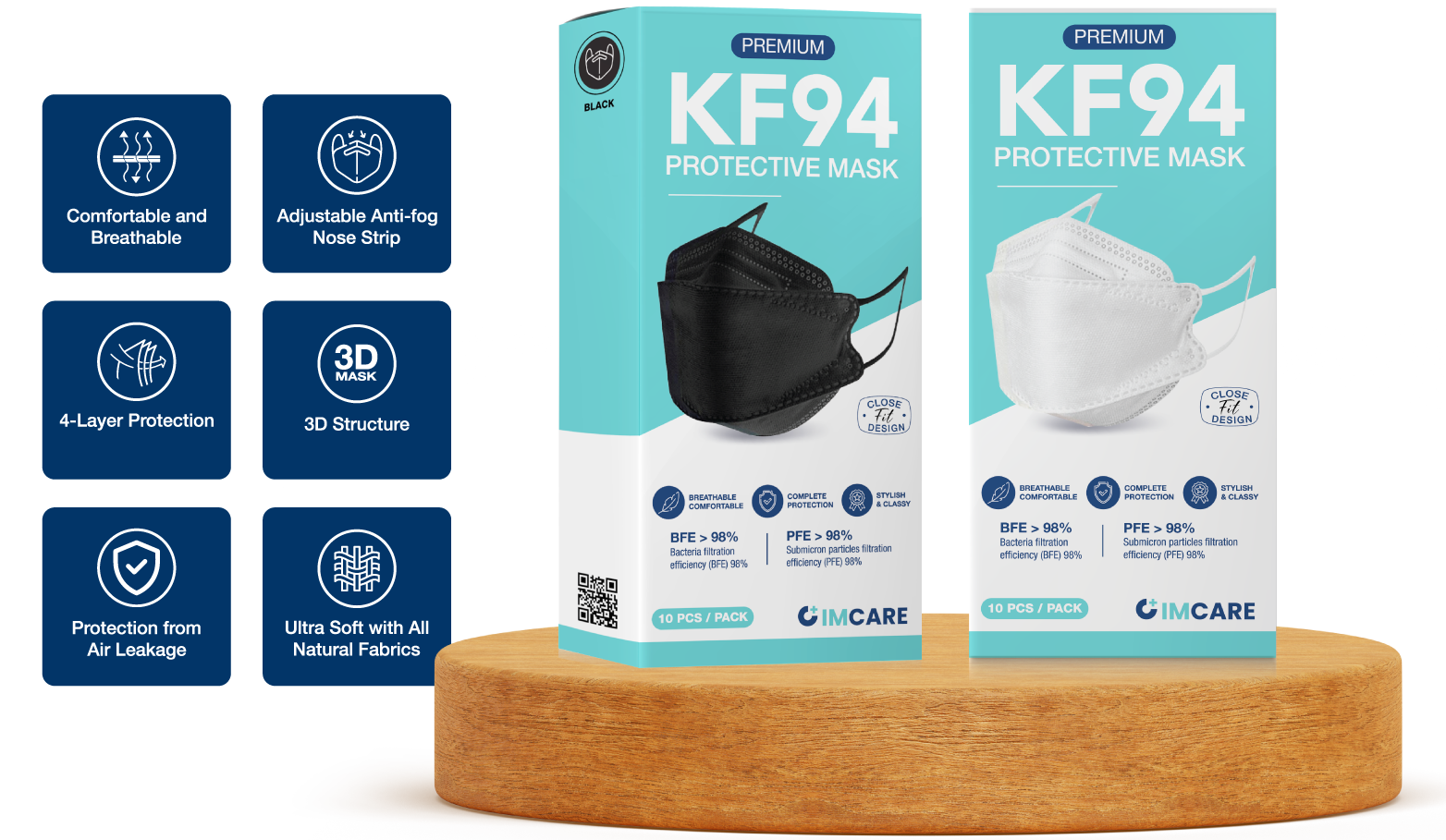
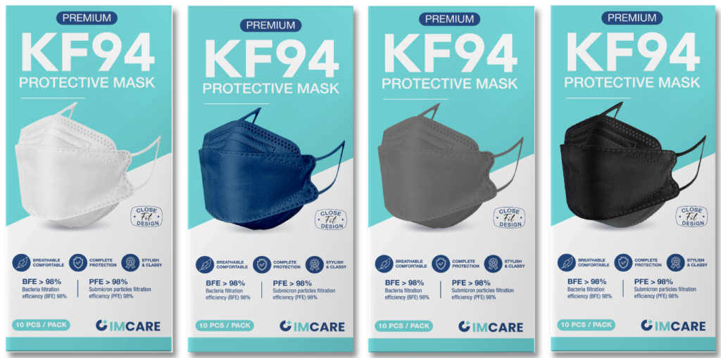
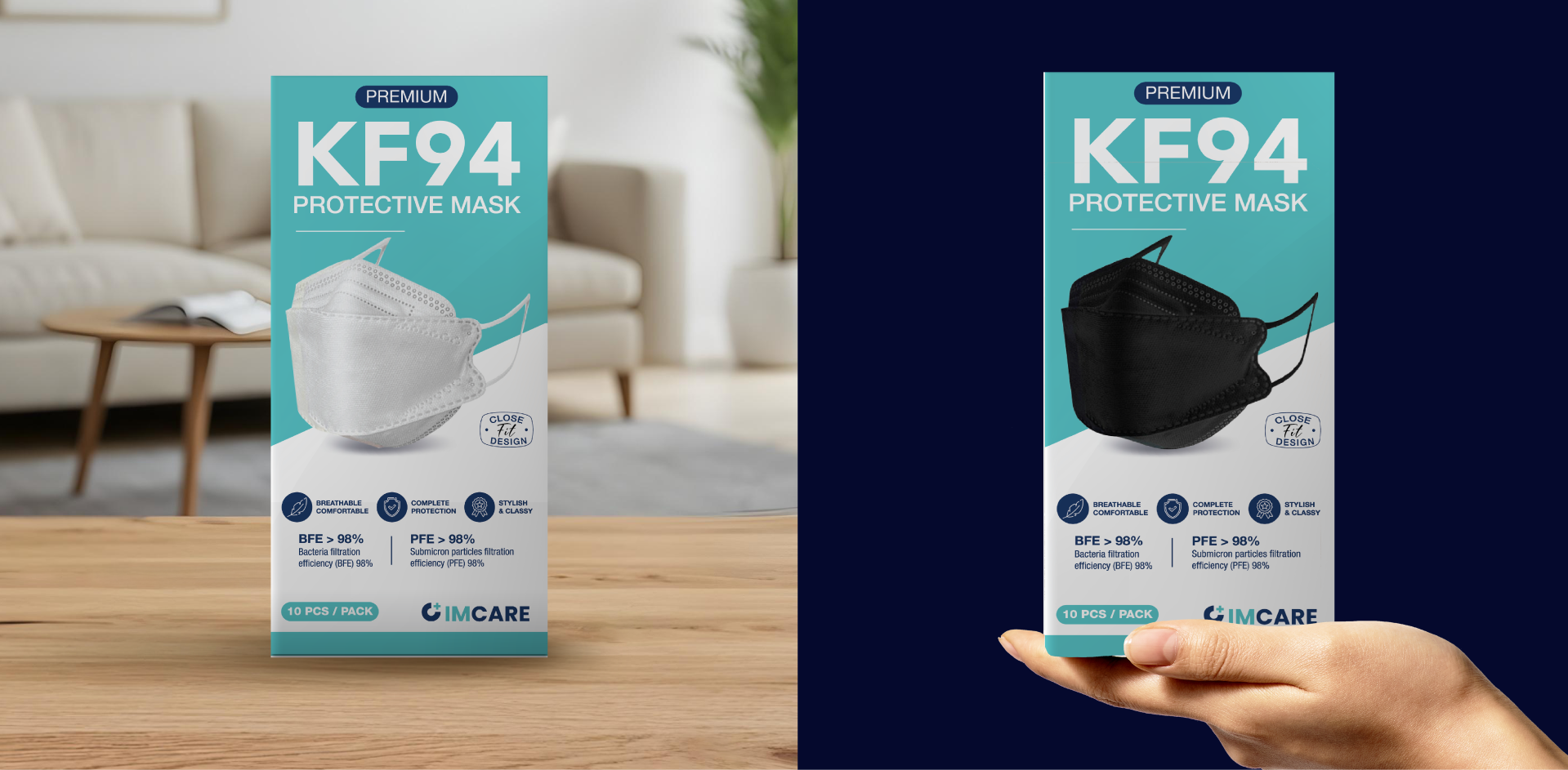
The IMCARE packaging is designed to convey protection and reliability through a clean, structured layout. The teal and white color palette reflects a medical, hygienic feel while remaining calm and approachable. Key information like the KF94 grade is clearly highlighted on the front, supported by a strong product image to build trust and recognition.

The back uses simple icons and concise text to present features and instructions, ensuring easy understanding for users. Overall, the design balances clarity, functionality, and a modern medical aesthetic, making it suitable for everyday use across different environments.

The IMCARE social media campaign is designed to present protection as part of a modern, everyday lifestyle. Focusing on clean visuals and minimal composition, the content highlights the product’s key qualities—comfort, reliability, and versatility—while maintaining a consistent and recognizable brand presence.